01Overview
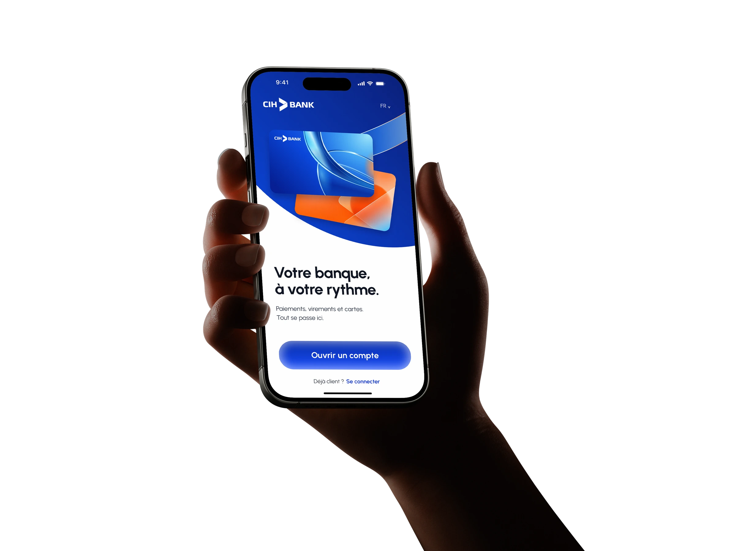
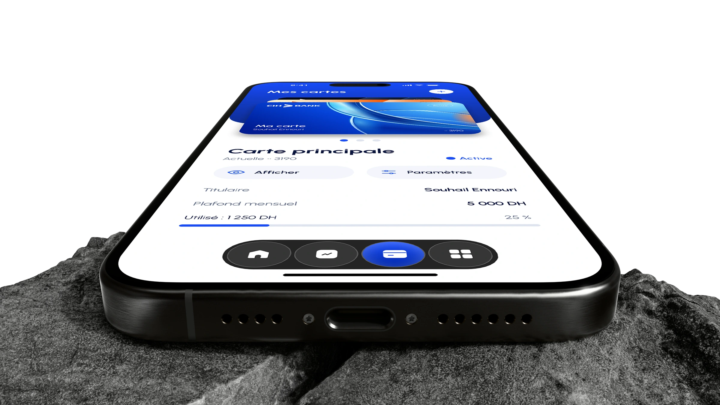
Banking is a daily habit. The interface should make it feel that way. A clearer balance, familiar actions and control where you expect it. A mobile concept built around the essentials.
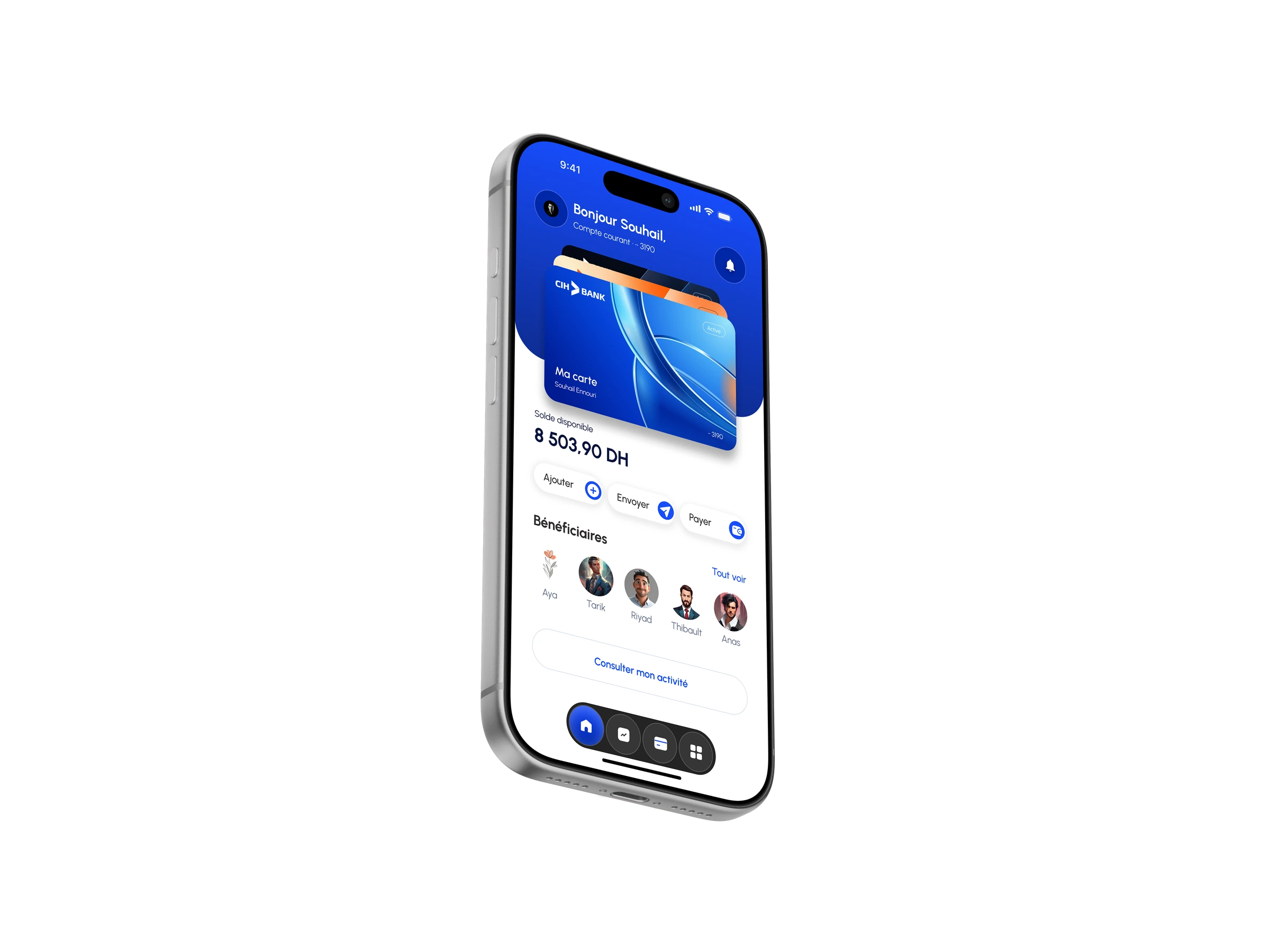
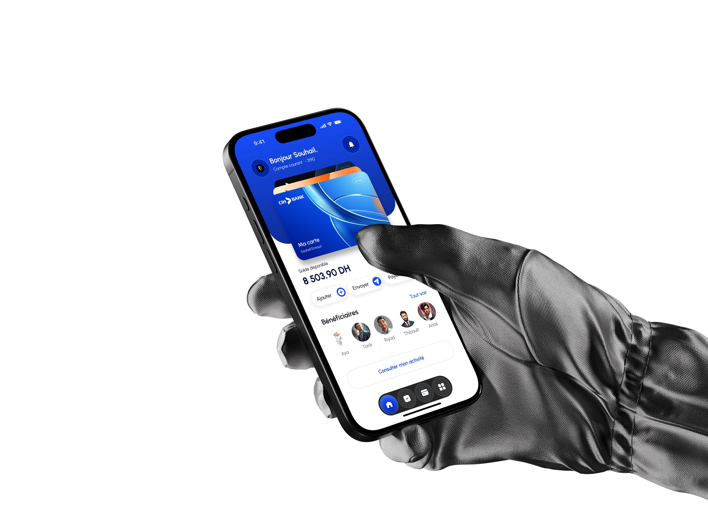
An app UX/UI redesign.
Not a redesign of the bank’s identity.
02Problem & solution · Interface audit
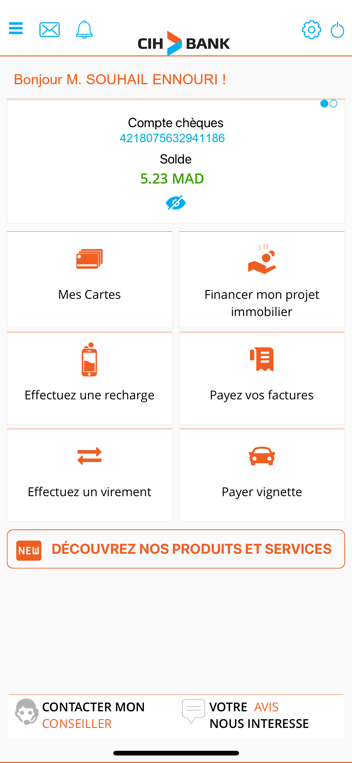
The existing interface puts account information, shortcuts and services on the same stage. The opportunity is to give everyday tasks a clearer order.
Problem
Balance checks compete with a large service grid. Frequent destinations sit behind a long menu, while transfer details share one dense form.
Observed in the supplied CIH screenshots.Design response
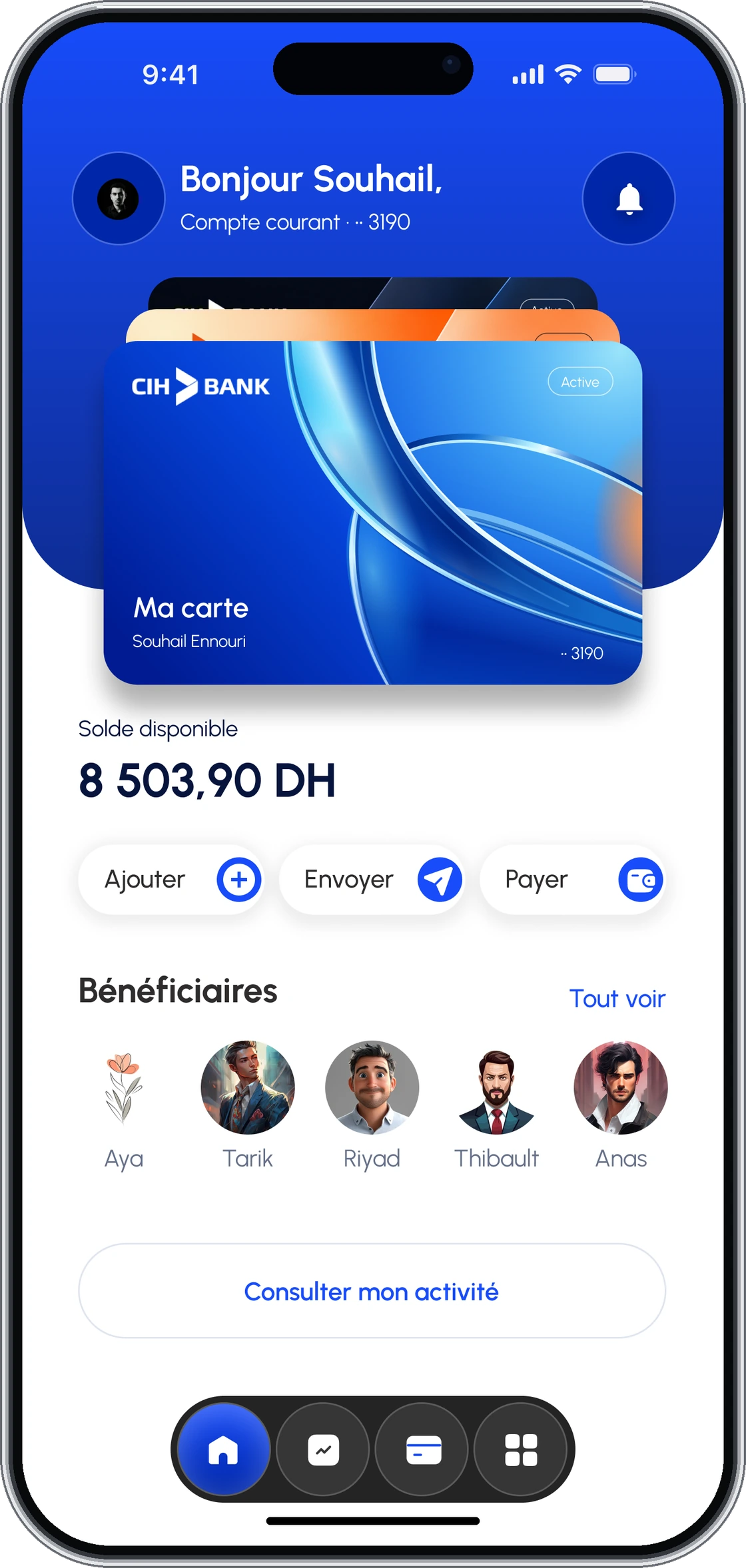
Bring the active card, balance and main actions together. Keep four destinations visible, and separate transfers into beneficiary, amount, review and confirmation.
See the original interface and the design response
03Competitive analysis · Moroccan mobile banking
Three local alternatives. Shared banking needs. A clearer direction for the CIH experience.
Swipe across to compare
| Capability |  Simple Simple |  Pocket Bank Pocket Bank |  BMCE Direct BMCE Direct |  Independent concept Independent concept |
|---|---|---|---|---|
| Account overview | ||||
| Bank transfers | ||||
| Saved beneficiaries | — | |||
| Card security controls | — | |||
| Mobile spending overview | — | — |
The opportunity is clearer navigation and task progression—not simply more features.
Sources & research notes
Official documentation reviewed 26 September 2026, not hands-on evaluation. “Not verified” does not mean unavailable. BANK OF AFRICA documents budgeting on the web; mobile availability was not established. CIH indicators refer only to the designed screens, not a released product.
- Simple: official product documentation
- Pocket Bank: official product documentation
- BMCE Direct: official product documentation
- Simple: publisher’s app description (accounts, beneficiaries and spending)
Logos belong to their respective owners. No usability ranking or feature superiority is claimed.
04User persona · Design hypothesis
A focused working profile to keep decisions grounded in quick checks, repeat transfers and everyday control.
Yasmine El Amrani
Digitally active account holder · Casablanca
Context
A digitally active account holder in Casablanca who uses mobile banking for quick checks, repeat transfers, card control and monthly orientation.
Goals & needs
- Check balance without exposing sensitive details
- Repeat common payments with fewer decisions
- Control card behaviour without visiting a branch
Potential frustrations
- Dense menus
- Competing visual priorities
- Unclear progress in transactional flows

This fictional profile organises design assumptions. It is not presented as an interview participant or validated research evidence.
05User flow
One home, four destinations. Related tasks stay connected, and the transfer journey has a clear beginning and end.
- Spending→Activity
- Cards→Card settings
- Services
- Send money
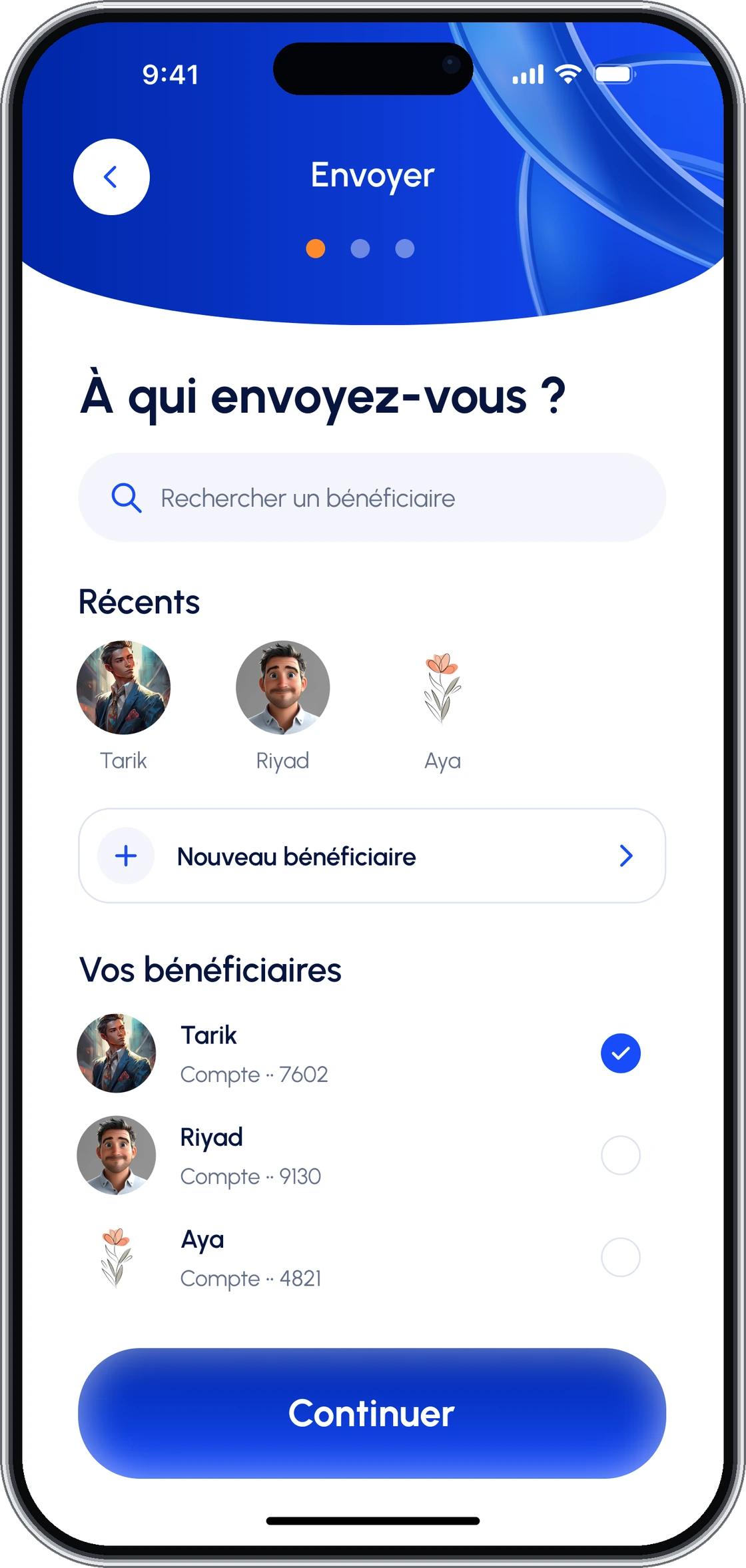
- 01Beneficiary
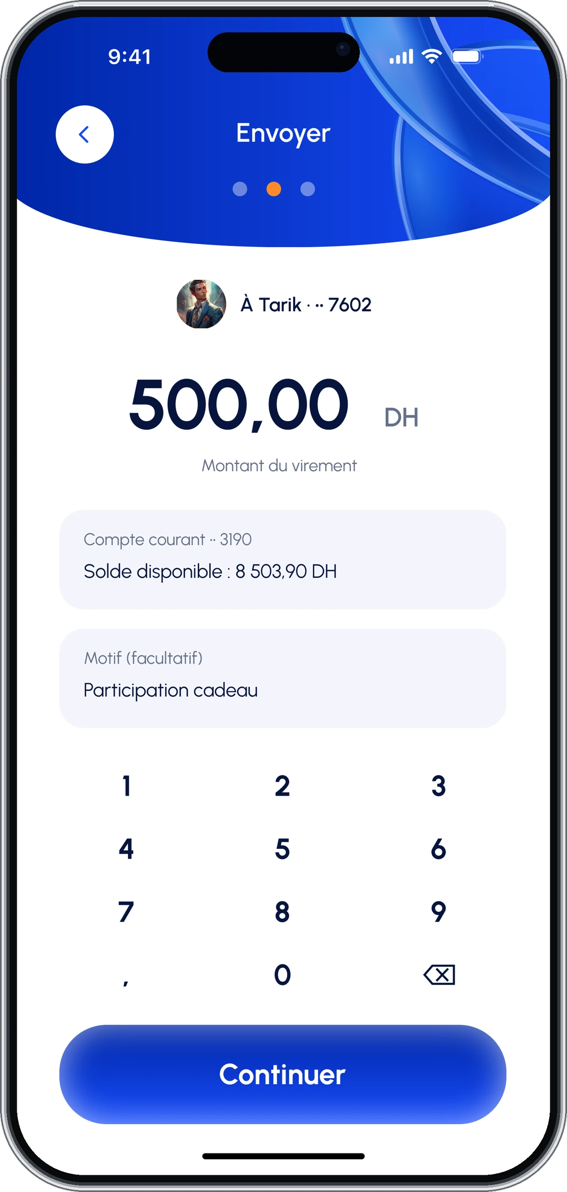
- 02Amount
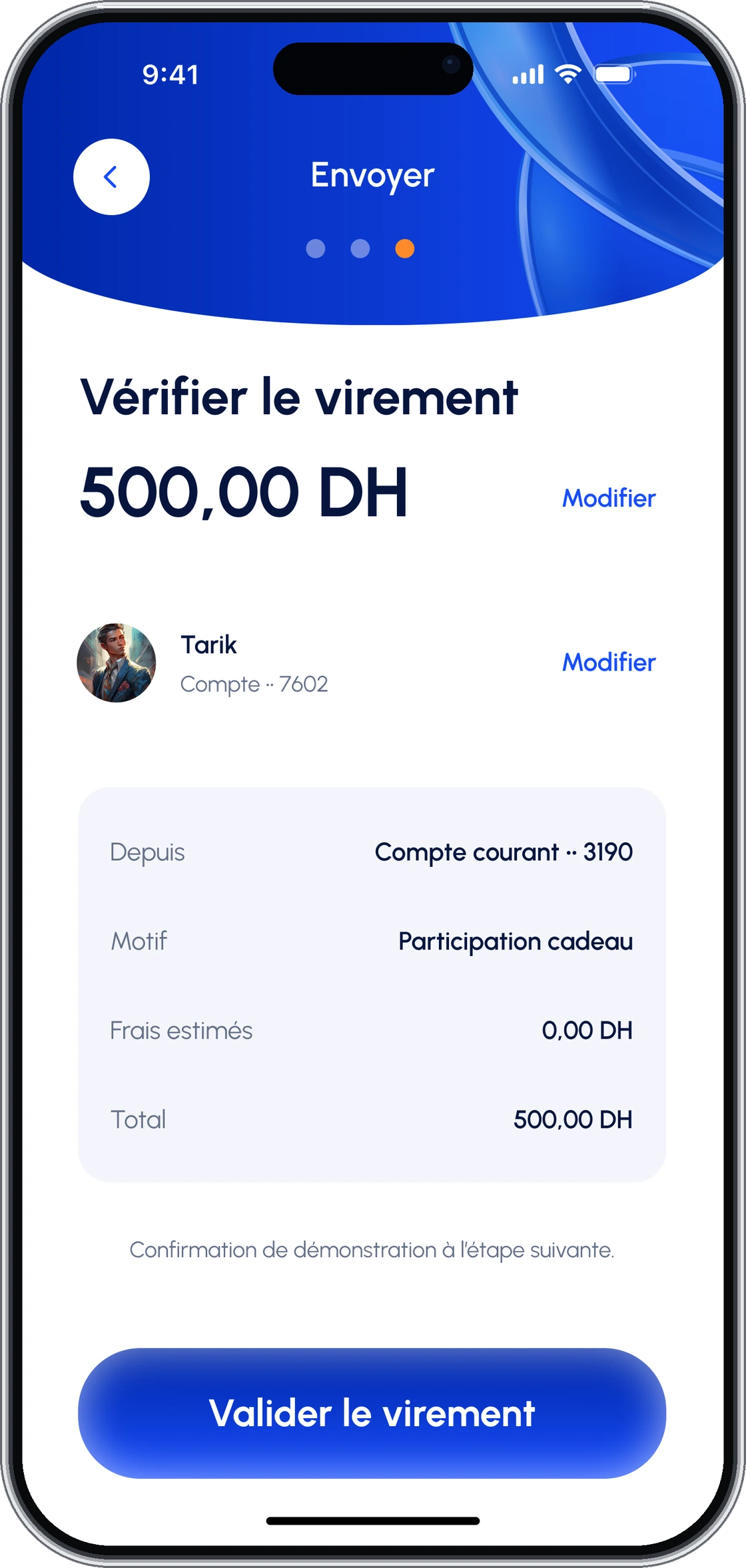
- 03Review
- 04Confirmation
06Wireframes
Remove the surface. The hierarchy should still make sense. Three simplified views expose the relationships between information, actions and navigation.
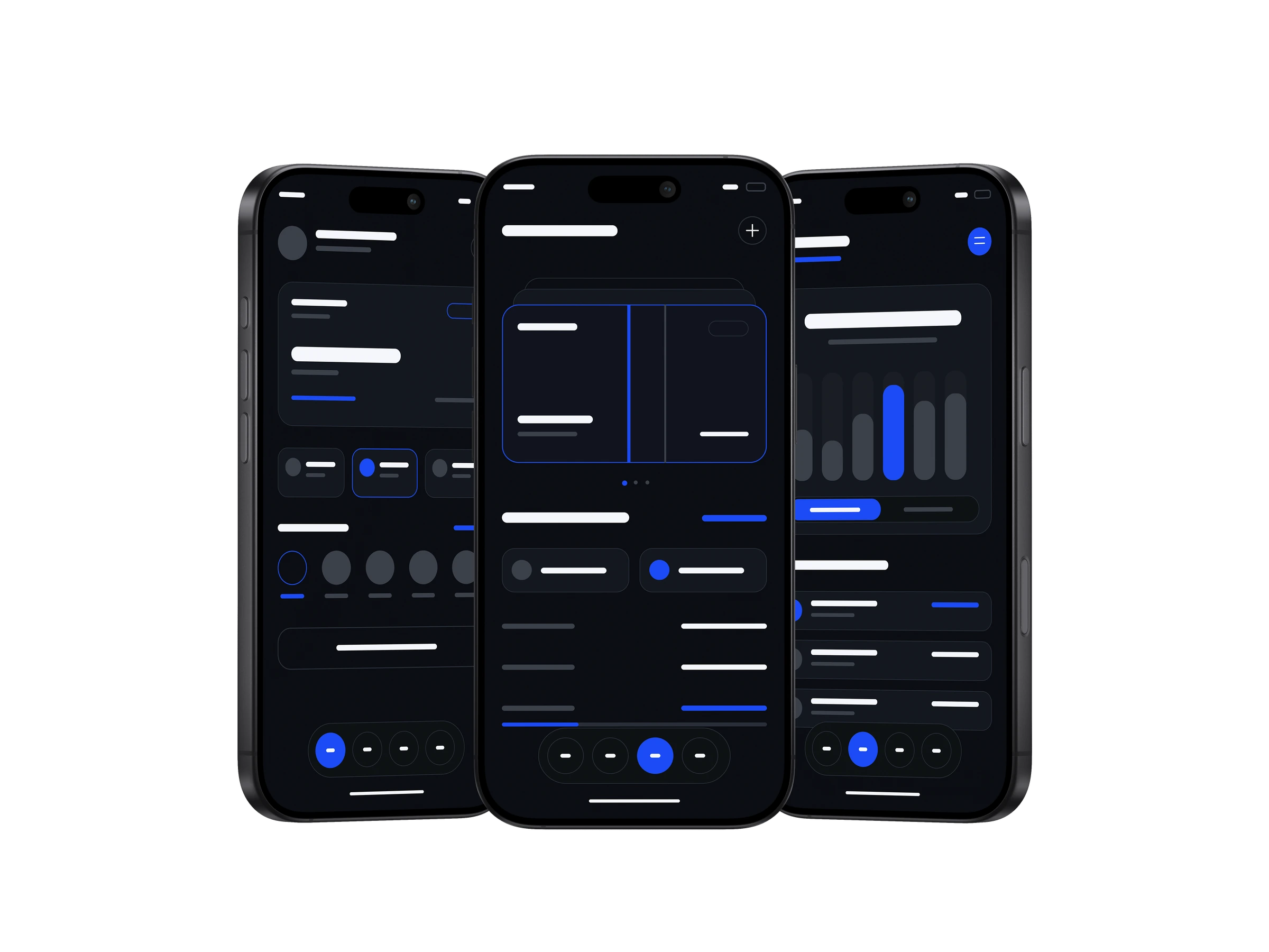
Orient first
Make balance, active card and current state readable before presenting secondary services.
One decision at a time
Separate transfer steps so review and confirmation carry their own visual weight.
Control in context
Keep card settings, spending evidence and service discovery close to the objects they affect.
Retrospective structural studies derived from the completed screens, not an earlier research or wireframing phase.
07Typography & colour
Urbanist brings the system together. Clear amounts, compact labels and a softer geometric voice. Blue leads; orange remains a selective CIH accent.
400 / RegularAa Bb Cc Dd
0123456789
500 / MediumAa Bb Cc Dd
0123456789
600 / SemiboldAa Bb Cc Dd
0123456789
700 / BoldAa Bb Cc Dd
0123456789
Action blue#2054F5
Deep navy#061B59
Signal orange#FF5A1F
Cloud white#F4F6FB
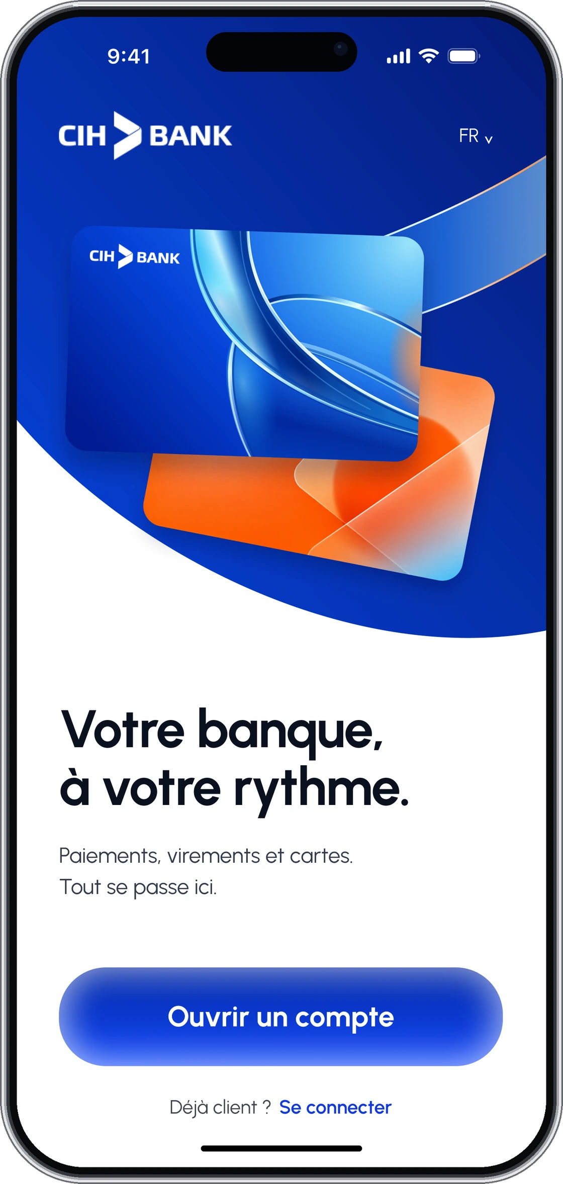
One type family.
A clear hierarchy.
Material adds character.
08Interface anatomy
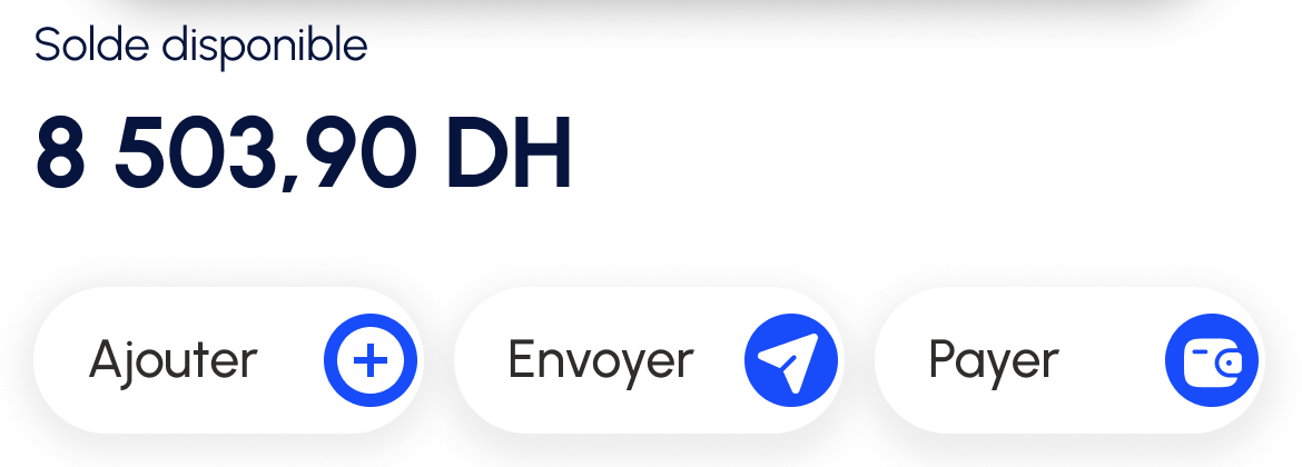
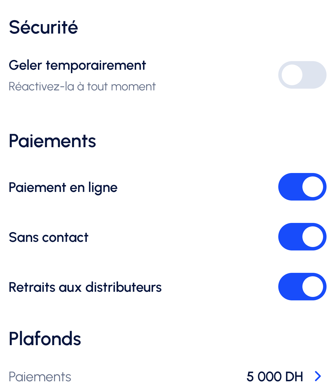
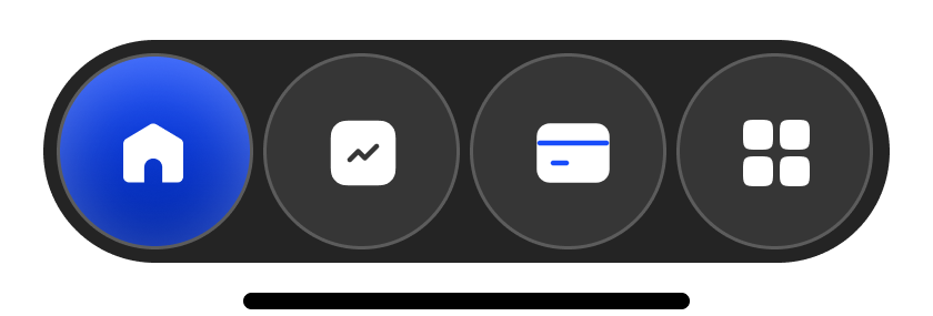
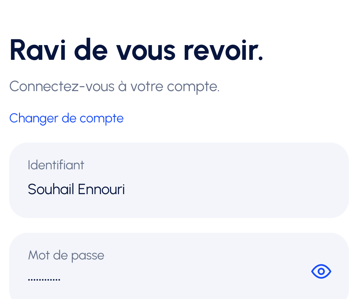
Built from the screens, not a decorative UI kit. Consistent alignment, recognisable actions and the same control language across the experience.
A shared edge.
A deliberate rhythm.
- 01 / Content
- Titles, fields and actions share a consistent content area.
- 02 / Grouping
- Related information stays together, with space between tasks.
- 03 / Navigation
- The main destinations remain anchored at the base.
Alignment overlay for presentation; not a claim of measured Figma grid tokens.
09Card design
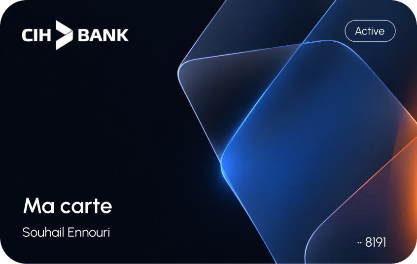
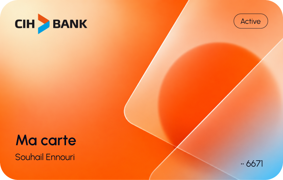
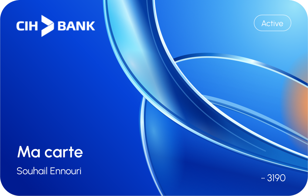
Three expressions. One unmistakable system. Optical blue, warm orange and deep ink give digital cards their own material presence.
10Spending & activity
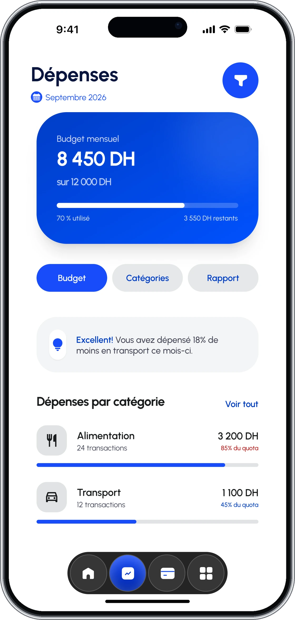
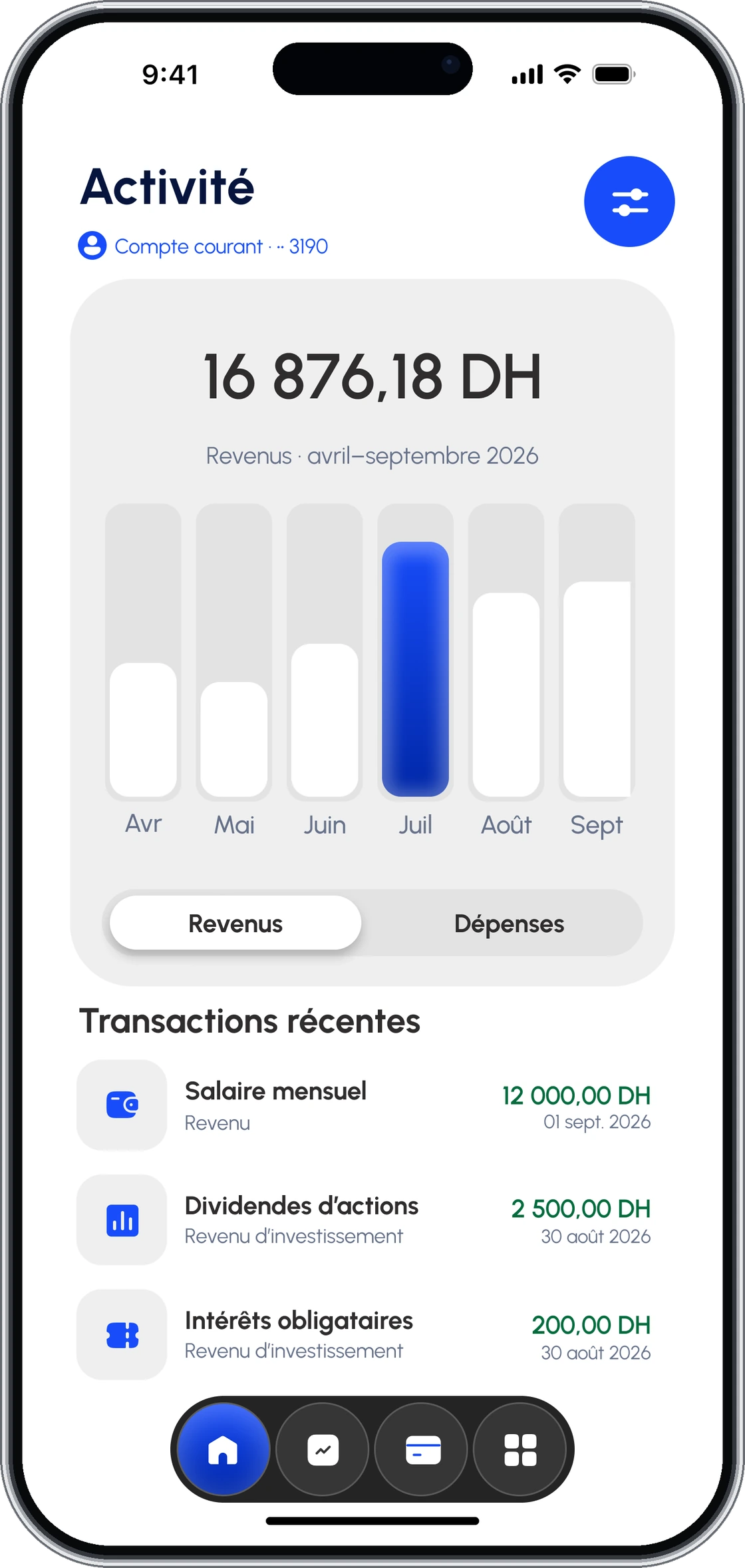
Start with the month. Then understand the detail. Spending, budget and recent activity share one visual language.
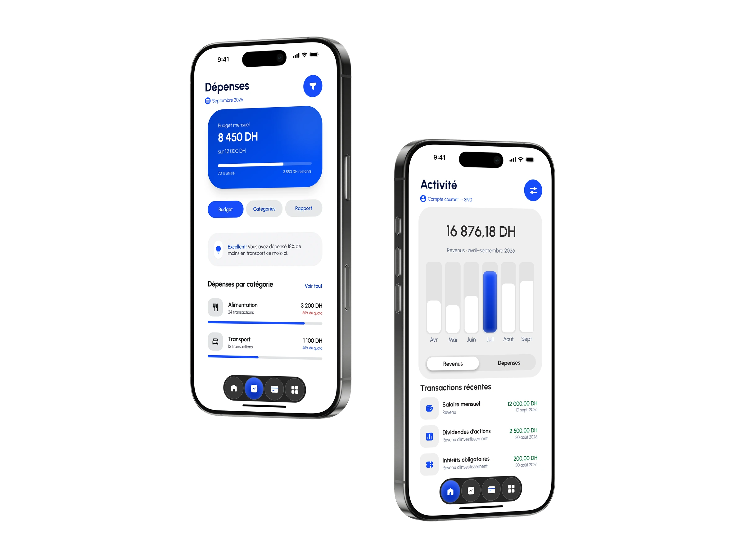
A summary for orientation.
Details for the next decision.
11Transfer flow
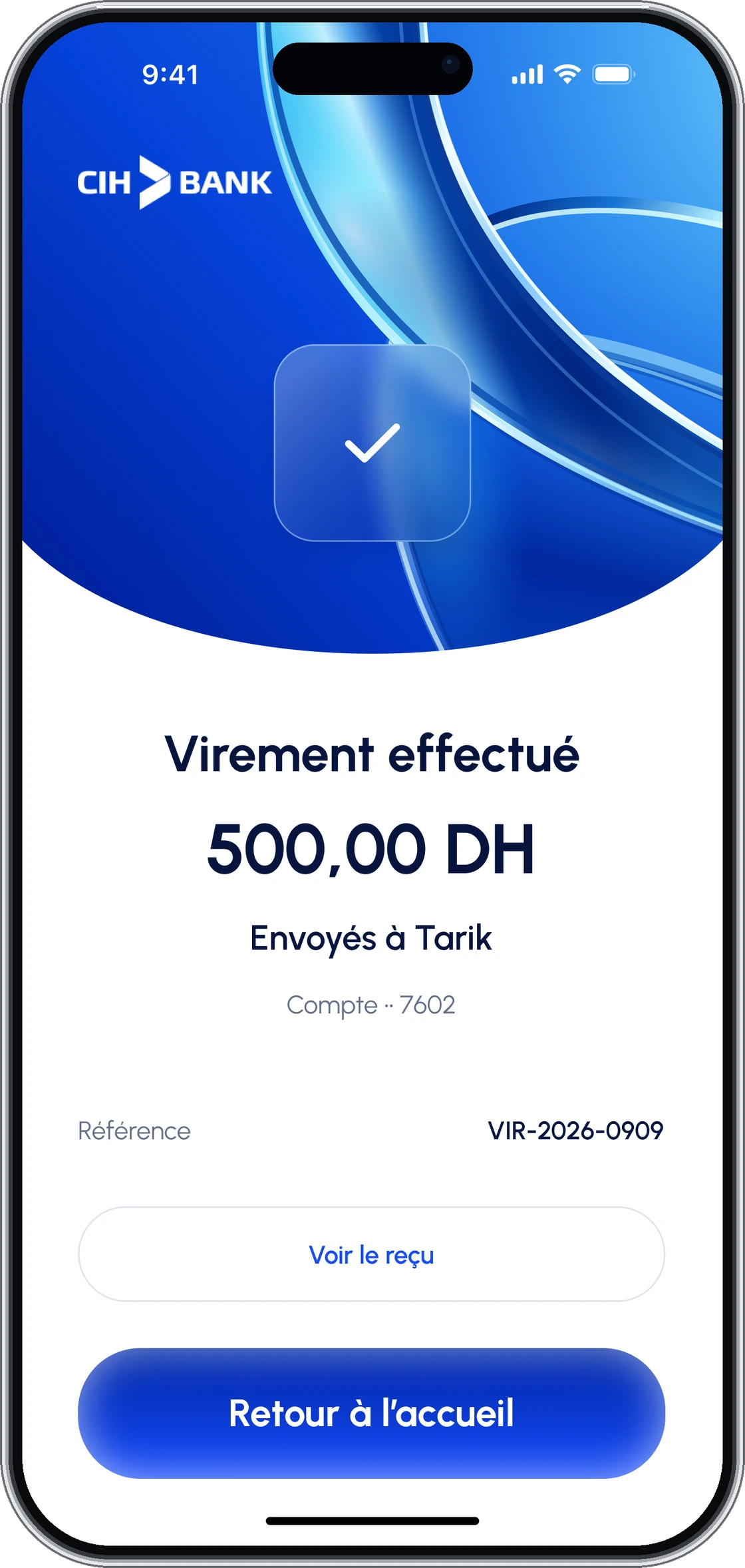
Choose who. Set the amount. Check the details. Then a confirmation that closes the loop.
01Beneficiary
02Amount
03Review
04Confirmation
12Full design preview
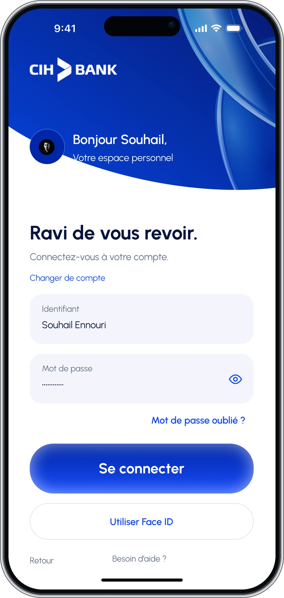
Twelve screens. The whole experience. From the first welcome to a completed transfer, organised around the tasks they support.
A familiar way in.
Your day-to-day, together.
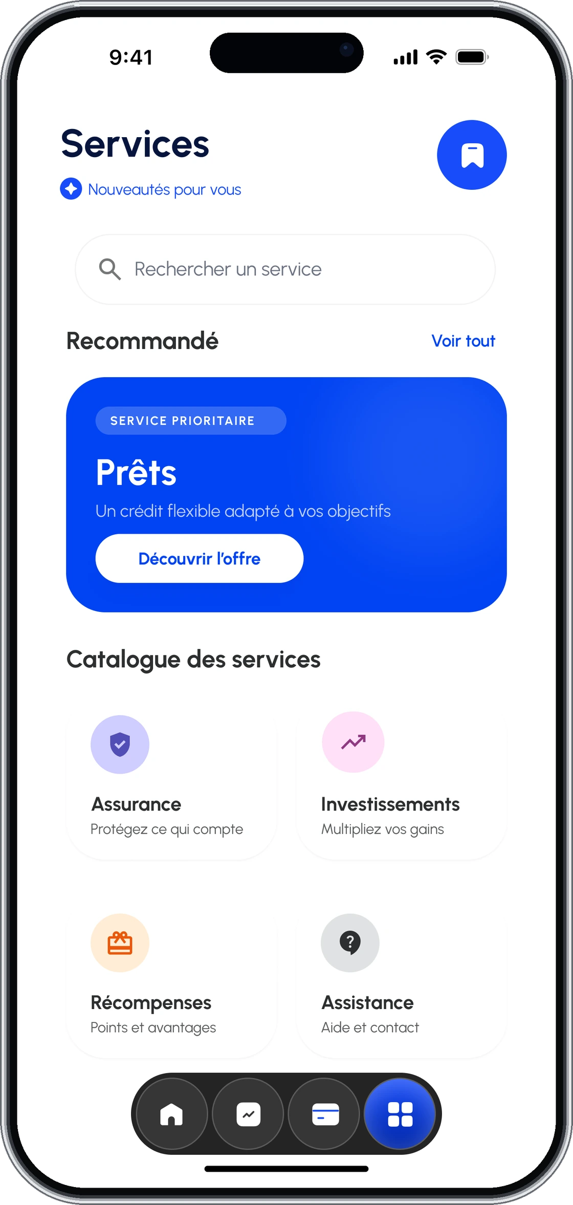
Useful services. Visible controls.
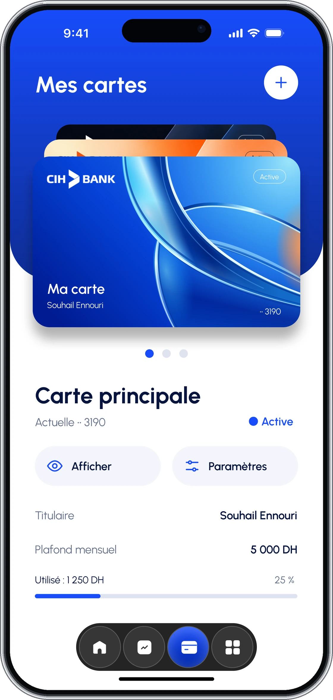
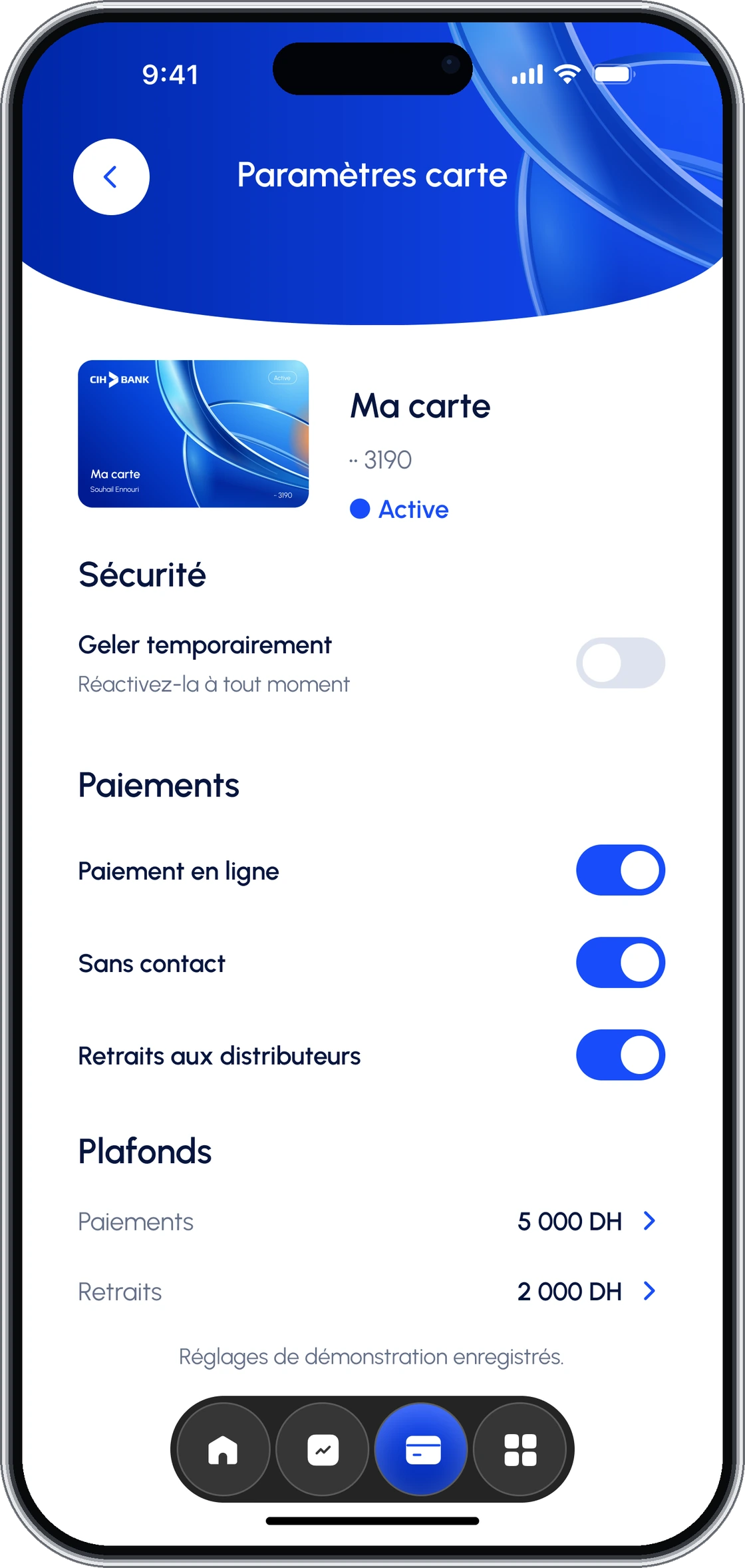
From intention to confirmation.
13Interactive prototype
Don’t just look.
Take a look around.
Explore the connected screens and follow the transfer journey in Figma.
Open the prototypeIndependent academic UX/UI concept by Souhail Ennouri. CIH Bank trademarks remain the property of their owner. No affiliation, commission or measured product results are implied.